
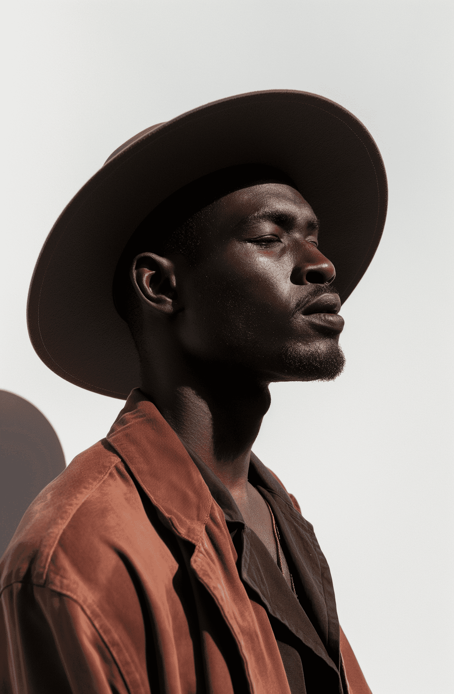
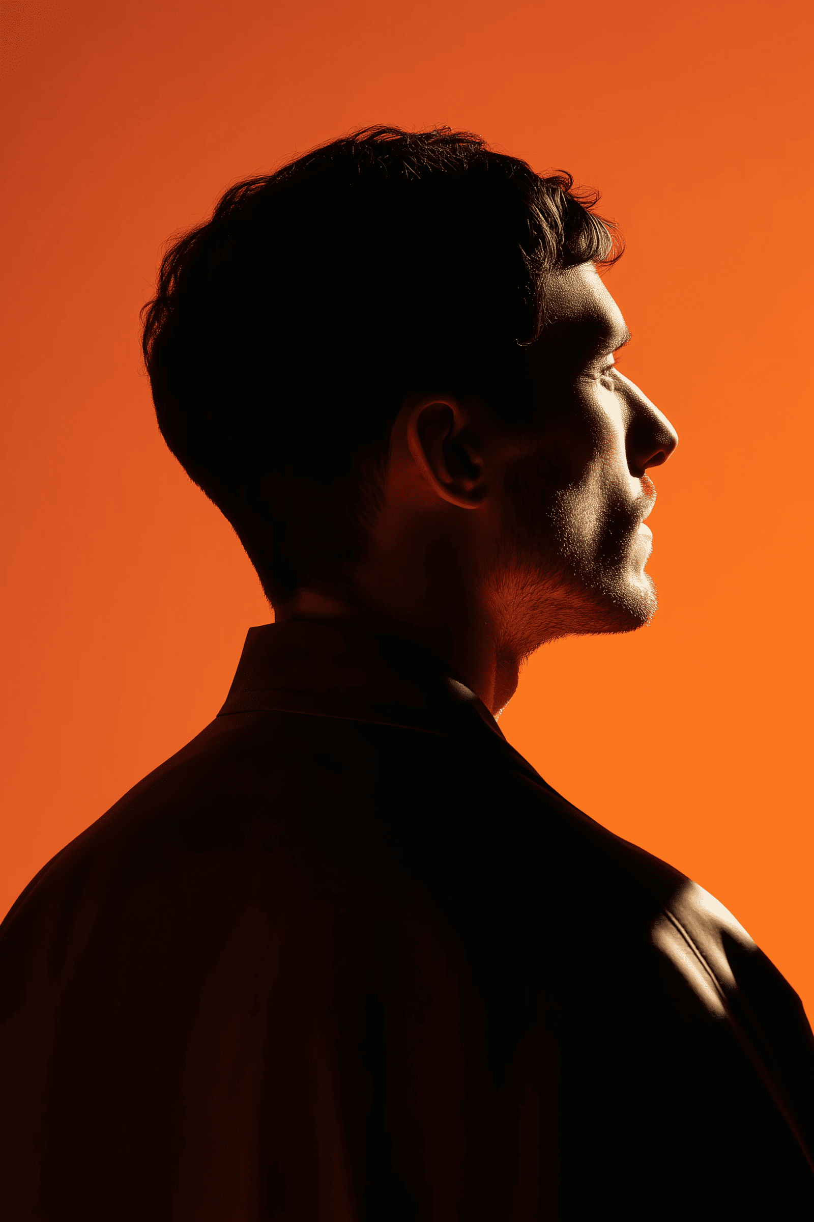
CloudArc
Visual identity and web system built to express technical sophistication with calm precision.
Year:
2024
Location:
London, UK
Service:
Branding

CloudArc Consultancy
01
+52%
Brand Recognition
Clearer identity and visual system improved platform memorability across channels.
02
+29%
Brand Recognition
Visitors stayed longer after restructuring content hierarchy and messaging.
03
78%
Navigation Success
Users reached the intended content faster with fewer dead ends and exits.
NEXT STEP
Ready to unlock similar results?
Let's explore your project, no obligations.
•
CLIENT TESTIMONIAL
They made our brand feel global — structured, credible, and unmistakably premium.

CloudArc Consultancy
2024


•
THE PROBLEM
CloudArc was a respected cloud infrastructure consultancy, but their digital presence didn’t reflect that reputation. Their logo lacked coherence, their colors felt outdated, and their site structure was cluttered with inconsistent typography. Internally, they had no visual system to connect brand, website, and presentation materials — every asset looked disconnected. This caused confusion among new leads and weakened client trust, especially during enterprise pitches.

They needed a new visual identity and web foundation that could express precision and calm authority — something that would scale across both print and digital environments while visually aligning with their expertise in system architecture.

•
THE SOLUTION
We began with a complete brand audit, identifying their strongest visual themes — geometry, light, and grid logic — and reinterpreted them through a modern minimalist lens. The logo evolved into a clean network-inspired mark with perfectly balanced spacing and optical weight. We introduced a neutral palette built around grayscale layers accented with Apple Blue, symbolizing stability and innovation.

Typography and composition became the backbone of the new identity: DT Getai was used for display headlines, and Inter handled clarity in the body copy. The new web system was built in Framer using reusable CMS components, allowing the team to update projects, blog posts, and services instantly without breaking structure.
•
THE RESULT
After launch, CloudArc’s new identity unified every touchpoint — website, presentations, proposals, and social media templates all shared one design system. Within two months, inbound consultation requests increased by 58%, and average session time on the site nearly doubled.

More importantly, clients began referencing the brand aesthetics as a reason for choosing CloudArc over competitors, describing it as “calm confidence.” The rebrand didn’t just modernize their visuals — it elevated their entire market perception to that of a global consultancy.
•
FROM THE ARCHIVE


•
THE NEXT STEP
Let's Build Momentum
A focused build process that turns ideas into momentum — without chaos, delays, or guesswork.
Proven
Outcome
120+ product & brand launches
97% on-time delivery rate
+38% average lift in engagement
Engagement Timeline
24-hour first response
72-hour kickoff after intro call
14-day first deliverable window
CloudArc
Visual identity and web system built to express technical sophistication with calm precision.
Year:
2024
Location:
London, UK
Service:
Branding
CloudArc Consultancy
01
+52%
Brand Recognition
Clearer identity and visual system improved platform memorability across channels.
02
+29%
Brand Recognition
Visitors stayed longer after restructuring content hierarchy and messaging.
03
78%
Navigation Success
Users reached the intended content faster with fewer dead ends and exits.
NEXT STEP
Ready to unlock similar results?
Let's explore your project, no obligations.
•
CLIENT TESTIMONIAL
They made our brand feel global — structured, credible, and unmistakably premium.
CloudArc Consultancy
2024
•
THE PROBLEM
CloudArc was a respected cloud infrastructure consultancy, but their digital presence didn’t reflect that reputation. Their logo lacked coherence, their colors felt outdated, and their site structure was cluttered with inconsistent typography. Internally, they had no visual system to connect brand, website, and presentation materials — every asset looked disconnected. This caused confusion among new leads and weakened client trust, especially during enterprise pitches.

They needed a new visual identity and web foundation that could express precision and calm authority — something that would scale across both print and digital environments while visually aligning with their expertise in system architecture.
•
THE SOLUTION
We began with a complete brand audit, identifying their strongest visual themes — geometry, light, and grid logic — and reinterpreted them through a modern minimalist lens. The logo evolved into a clean network-inspired mark with perfectly balanced spacing and optical weight. We introduced a neutral palette built around grayscale layers accented with Apple Blue, symbolizing stability and innovation.

Typography and composition became the backbone of the new identity: DT Getai was used for display headlines, and Inter handled clarity in the body copy. The new web system was built in Framer using reusable CMS components, allowing the team to update projects, blog posts, and services instantly without breaking structure.
•
THE RESULT
After launch, CloudArc’s new identity unified every touchpoint — website, presentations, proposals, and social media templates all shared one design system. Within two months, inbound consultation requests increased by 58%, and average session time on the site nearly doubled.

More importantly, clients began referencing the brand aesthetics as a reason for choosing CloudArc over competitors, describing it as “calm confidence.” The rebrand didn’t just modernize their visuals — it elevated their entire market perception to that of a global consultancy.
•
FROM THE ARCHIVE
•
THE NEXT STEP
Let's Build Momentum
A focused build process that turns ideas into momentum — without chaos, delays, or guesswork.
Proven
Outcome
120+ product & brand launches
97% on-time delivery rate
+38% average lift in engagement
Engagement Timeline
24-hour first response
72-hour kickoff after intro call
14-day first deliverable window